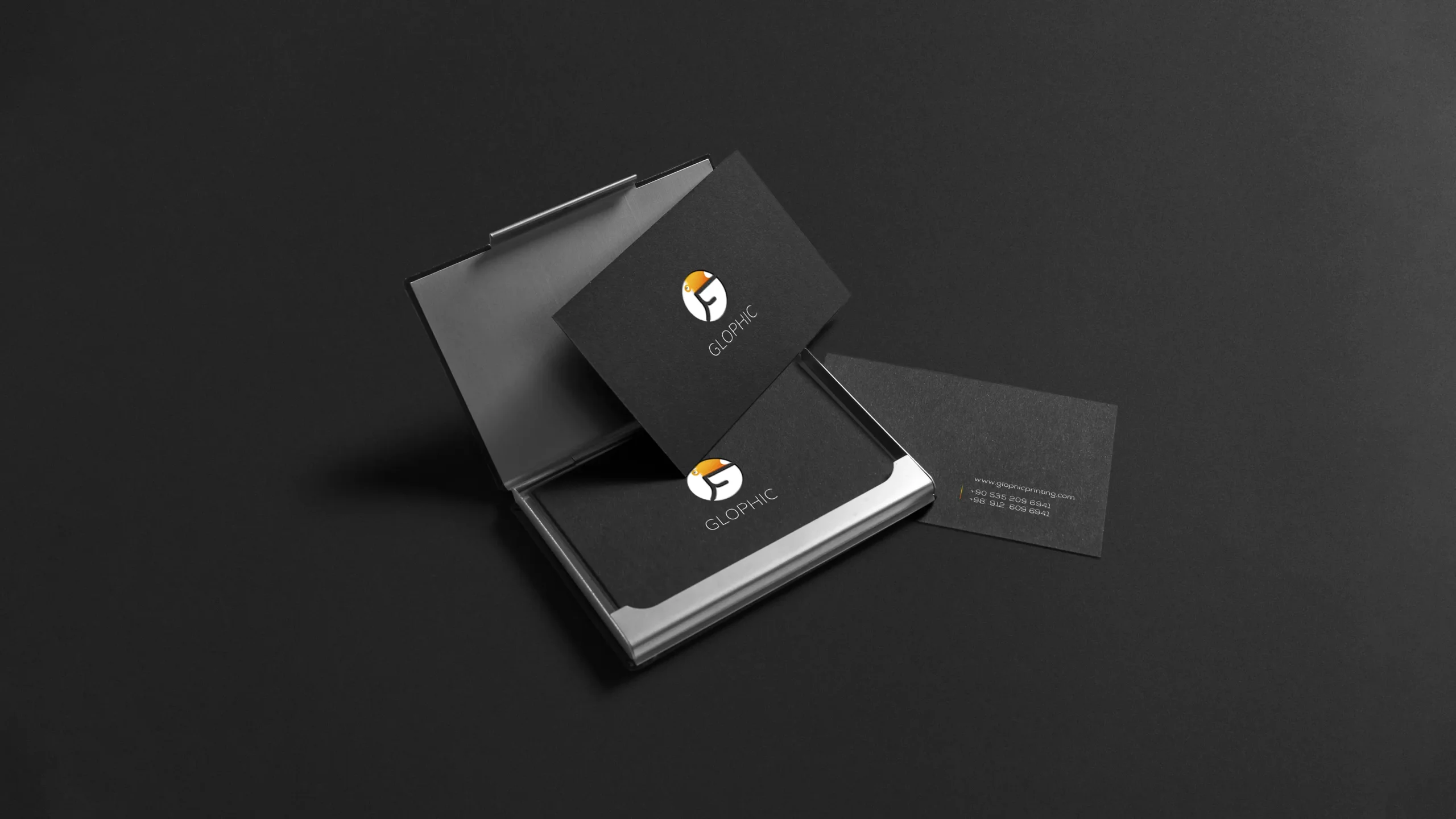
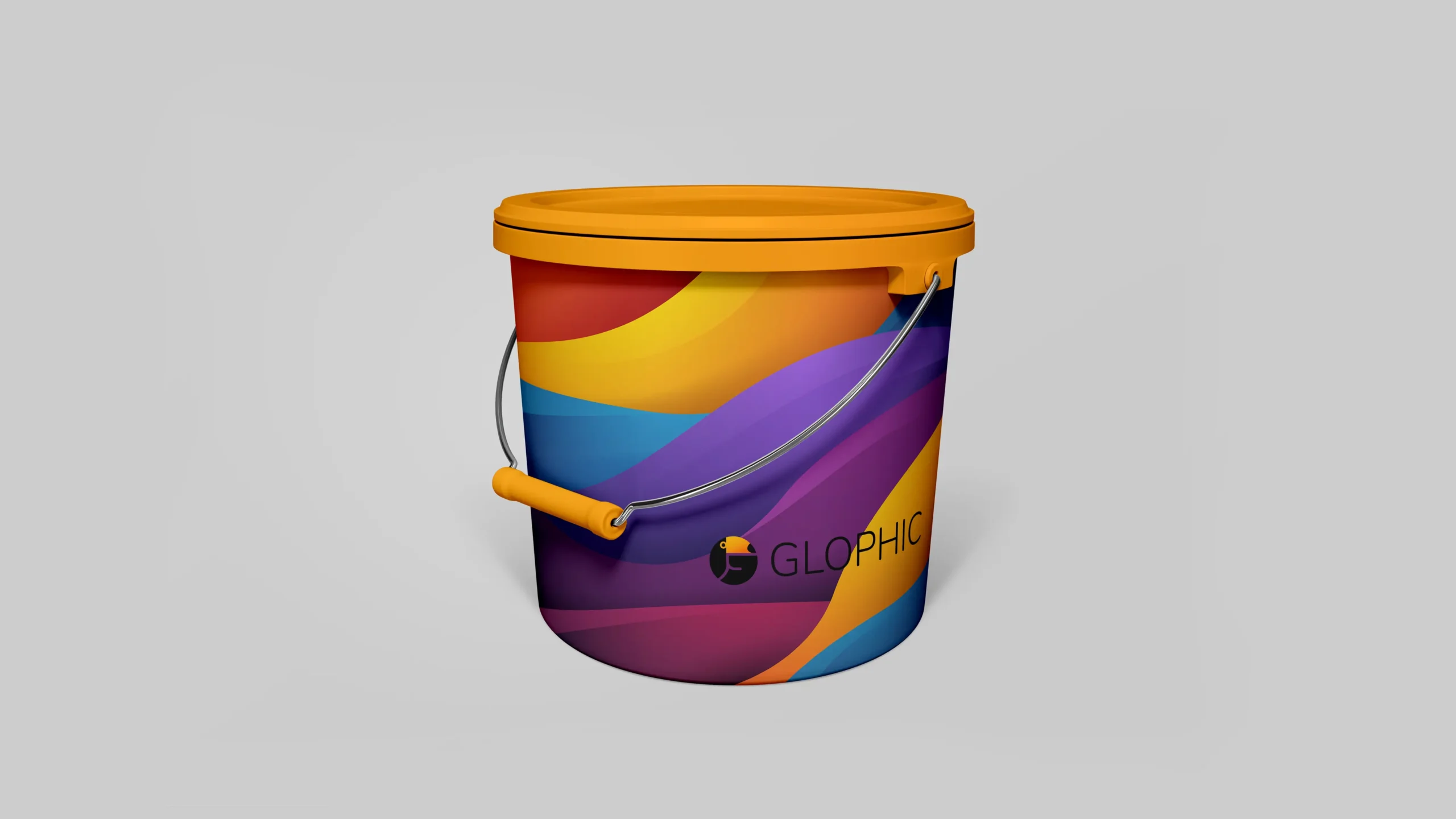
0   /   100
Branding

Glophic

Scroll Down
YEAR
2019
CLIENT
Glophic
ROLE
Rebranding, Corporate Identity
FIELD
Printing

I.

UNDERSTAND THE CONTEXT

Glophic is a printing complex in Sydney. In the 14 years since it was founded, this coherent and active collection has continued to provide new products and services based on three important factors: low price, good quality and high speed, as well as a variety of exclusive and general products, all geared towards meeting the needs of its customers and colleagues. All kinds of pre-printing, printing and post-printing services are available in the Glophic.

III.

PROCESS

I spent a considerable amount of time discussing their problem, requirement, and request in our first meeting. As soon as I collected all the necessary information for the design, I started brainstorming and began trying to solve the problem. As a result of designing some sketches and receiving client feedback, I chose to use Toucan as the main concept and G as the initial of Glophic. Glophic is a printing complex and their work is influenced by color, so we chose the Toucan for the logo because of its colorfulness. It was important to me that the viewer understood Glophic's characteristics after viewing it.

III.

OUTCOME

As a result of rebranding and creating an attractive identity, the complex took a 35% larger share of the market through advertising.

Sanjup

Keep Scrolling